Diamond Color Pricing: Where the Money Stops
G and H are often where the money starts working harder than the letter grade.
By Josh Allen, Co-Founder of YourDiamondGuys.com. Fifth generation diamantaire with 30 plus years in the global diamond trade.
Diamond color pricing gets expensive before most eyes get happier.
D color is rare. E and F are beautiful. No argument there.
But the real buyer question is different. Does the higher color grade make this diamond look better in the setting you are actually buying? If the answer is no, the money probably belongs somewhere else.
Where Color Value Usually Starts
For natural diamonds, start with GIA.
Then look at the diamond, not just the letter. In many round brilliant diamonds, G and H can look white to most buyers, especially when the cut is strong. That is why those grades often become the value zone.
You are not trying to win a color chart. You are trying to buy a ring that looks beautiful in real life.
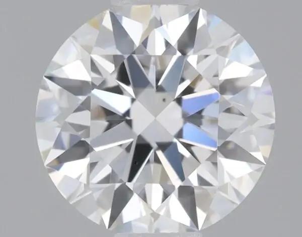
D VS2 round reference, Ideal cut, Excellent polish and symmetry. Rare, icy, and priced for it.
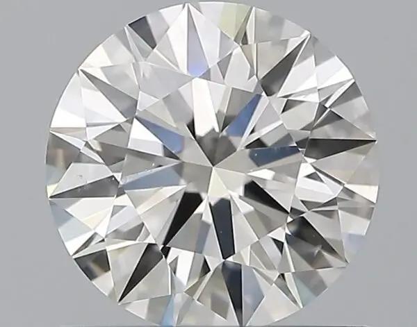
G VS2 round reference, Excellent cut, polish, and symmetry. Often a strong white looking value lane.
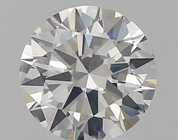
I SI2 round reference, Excellent cut, polish, and symmetry. Warmth needs metal and lighting context.
The Color Grade Is Not The Whole Look
Color does not live by itself.
Cut, shape, size, setting metal, fluorescence, and lighting all change how much color you actually see. A lively G can look better than a dull F. A well cut H in yellow gold can make more sense than a D that forced you to shrink the diamond.
A brighter diamond hides warmth better than a flat one.
White metal exposes warmth. Yellow gold can make slight warmth feel intentional.
Round brilliants hide color. Step cuts and elongated shapes show more.
When D, E, And F Are Worth Paying For
Pay for colorless when the reason is real.
D, E, and F make sense when you want that icy look, you are using platinum or white gold, the diamond shape shows color easily, or the whole build is meant to feel crisp and bright.
They also make sense when rarity matters to you. Some buyers want the top color range because it feels clean in their head. That is fine. Just know what you are buying.
Trade tip: Dealers can spot the buyer who is paying for the letter instead of the diamond. The letter gets attention. The actual stone earns the money.
When G And H Are The Better Buy
G and H are where a lot of smart money lands.
In round brilliant diamonds, those grades can look plenty white while leaving more budget for cut quality, carat size, clarity safety, or the setting. That trade can make the ring better, not cheaper.
This is where buyers often relax once they see the stones side by side. The paper gap feels bigger than the visual gap.
When I And J Can Work
I and J need more context.
In yellow gold, a well cut round can still look beautiful because the setting already brings warmth into the design. In white metal, the same grade needs a closer look, especially from the side.
Do not buy I or J because the price looks tempting. Buy it because the diamond, setting, and your eye all agree.
Shape Changes The Color Price Stop
| Shape | Color Strategy | Why |
|---|---|---|
| Round brilliant | G and H are often strong value. I can work with care. | Brilliant faceting hides warmth better than most shapes. |
| Oval and pear | Check tips, edges, and bow tie zones before dropping color. | Warmth often gathers where the shape narrows. |
| Cushion and radiant | Look at the actual facet pattern before deciding. | Some patterns hide color better than others. |
| Emerald and Asscher | Lean cleaner if you want a crisp white look. | Broad step facets show body color more honestly. |
| Large diamonds | Raise your color standard as size increases. | More surface area makes warmth easier to see. |
Before you compare color across outlines, read our diamond price by shape guide. Shape changes the value math.
Metal Color Changes The Answer
White metal gives warmth less room to hide.
If you are using platinum or white gold, I get stricter, especially with step cuts, larger stones, and exposed side profiles. The metal is bright, so warmth stands out more.
Yellow gold and rose gold change the conversation. Slight warmth can look intentional. The diamond does not need to fight the setting. White prongs still need a closer look because they can create contrast against a warmer stone.
Cut Quality Can Beat Color
A brighter diamond often looks whiter.
That is why I would rather see a lively G with strong cut than a dull F with weaker performance. Light return changes how color reads. A flat diamond gives warmth more time to sit there and bother you.
For round natural diamonds, my safer cut lane starts with table 56 to 58 percent, depth 60 to 62.4 percent, crown angle 34 to 35 degrees, pavilion angle 40.6 to 41 degrees, Excellent polish and symmetry, and none to faint fluorescence.
Use the cut premium guide before paying for a higher color on a weaker make.
Fluorescence Can Change The Price
Fluorescence can lower price and add confusion.
Sometimes it has little visible effect. Sometimes it creates a question mark around transparency or value. For most buyers, none to faint keeps the decision cleaner.
If a diamond with stronger fluorescence looks like a bargain, ask why. See it in normal light. Look for haze or an oily look. Do not let a discount answer the question for you.
Where The Money Usually Stops
| Buyer Situation | Likely Stop Point | Josh Read |
|---|---|---|
| Round brilliant in yellow gold | H or I often deserves a look. | Put more money into cut and size if the warmth looks good. |
| Round brilliant in white gold | G or H is often the comfort zone. | Check side view and normal room light. |
| Emerald cut in platinum | F or G often feels safer. | Broad steps show body color more clearly. |
| Buyer wants icy white | D, E, or F makes sense. | You are buying a look and a rarity story. |
| Buyer wants best total value | G or H is often where I start. | The saved money can improve the whole ring. |
How To Compare Color Without Fooling Yourself
Look at diamonds the way you will wear them.
- Start natural diamond comparisons with GIA.
- Compare the same shape, similar carat weight, and similar cut quality.
- Look at the diamond face up first, then check the side.
- View it against the setting metal you plan to use.
- Use normal room light, not only bright jewelry lighting.
- Check fluorescence and transparency before trusting a discount.
- Use the price per carat calculator after the color comparison is fair.
Clarity And Color Trade Money Back And Forth
Budget does not live in one category.
If dropping from F to G lets you buy better cut, a cleaner eye clean clarity, or a more balanced size, that can be a smarter ring. If dropping color creates warmth you dislike, the savings are not worth it.
Use the clarity pricing guide with this page. Color and clarity both have points where the next grade stops helping the actual look.
Soft Grading Can Ruin Color Value
Color value only works when the grading baseline is real.
A soft G that behaves like an H should not price like a strict G. A non GIA natural diamond priced against GIA stones needs a deeper discount and a sharper review.
If the color grade and price look too convenient, read our overgraded diamonds guide before you trust the comparison.
My Buyer Rule
Stop paying when the next color grade does not make the ring look better. Put that money into cut, size, clarity safety, or the setting.
D color is beautiful. So is a well cut G that lets the whole ring make more sense.
The best buy is the one that looks right, not the one that wins a paper contest.
How is Diamond Color Assessed?
Where I Would Compare Color Value
Use these sites as comparison tools, not automatic recommendations. I would compare similar stones on Brilliant Earth and Blue Nile, then judge the video, setting metal, body color, lab report, and price before paying for a whiter grade.
Questions? Reach out directly for a free consultation, or drop them in the Diamond Buyers Academy community — Rob and Josh answer personally.
Questions Buyers Ask Us
More Diamond Pricing Guides
Keep the next step close. These guides connect the pricing math, seller model, quality risk, total cost, and resale expectation behind this buying decision.
Want Help Finding The Stop Point?
Send us the report, video, setting metal, and price. Rob or I can help you see whether the higher color grade earns the money or just makes the listing look nicer.
*Some links on our site may earn us a small commission at NO EXTRA cost to you, helping us keep our content free*